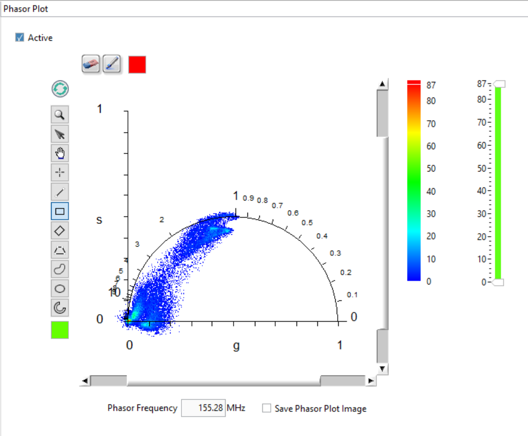
Phasor Plot Panel
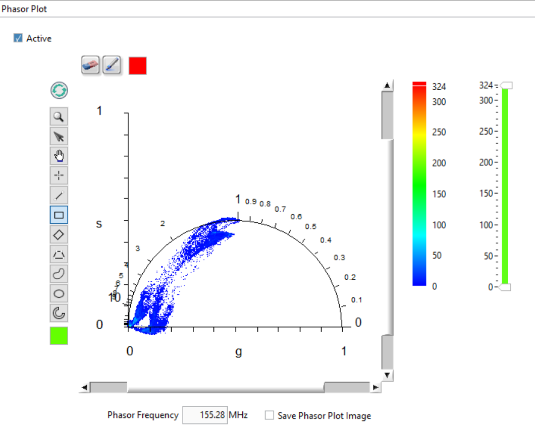
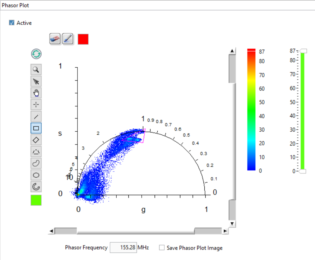
The Phasor Plot image of the Phasor Plot panel represents the phasors of all valid pixels as a color-coded map (a 2-dimensional histogram) as ahown below. Valid pixels are those whose decay meet the conditions defined in the Settings:Source Image* panel, as well as belong to allowed ROIs as defined in the **Settings:Phasor Plot panel.
The Phasor Frequency control, located below the Phasor Plot, allows selecting which phasor frequency is used when computing the phasor plot. This value is common to all panels in AlliGator and can be also set on the Phasor Graph panel or in the Settings window. The right-click menu for the Phasor Frequency control allows choosing a “natural” phasor frequency (or harmonic) based on the laser period T or the decay span D:
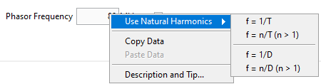
The first item using the base frequency f = 1/T, while the second allows selecting a different multiple. The other two options use D instead of T.
The phasor plot is calculated from the loaded dataset and is controlled by a number of dataset-independent parameters (described below), some of which are found in the Settings:Phasor Plot panel, but some others in the Settings:Fluorescence Decay:Decay Pre-Processing panel or the Settings:Phasor Graph panel.
Each time a new dataset is loaded, or the same dataset is reloaded with different settings, or a parameter is modified that would affect the phasor plot, the Phasor Plot Update Needed red LED at the bottom right of AlliGator’s main window lights up. If the parameters are restored to their original values used to compute the phasor plot (or when the phasor plot has just been computed), this :LED will turn off.
Phasor Plot Image Size, Aspect Ratio and Binning
The Phasor Plot image features the g and s axis of a standard phasor plot, as well as the universal semicircle (UC, in blue in the image above).
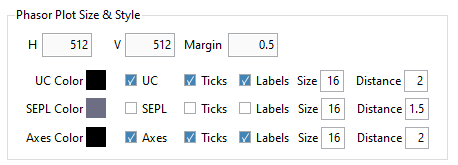
It is possible to specify the size of the image (H and V in pixels) in the Phasor Plot panel of the Settings window (see the corresponding manual page) as well as the extra space represented on the left and right of the UC (the Margin, expressed in fraction of the size of the UC). Changing these parameters will require refreshing the plot using the Refresh Phasor Plot button on the top left of the Phasor Plot:
(Note that in newer versions of AlliGator, the GUI might look slightly different).
The image size has an effect on the resolution of the phasor plot. Given a Margin parameter m, a pixel represents (1 + 2m)/H units horizontally, and (1 + 2m)/V vertically. Therefore, in order to build a phasor plot with bin resolution b, given a margin m, a number of pixels H = (1 + 2m)/b should be chosen. For instance, with m = 0.2 and b = 0.005, H = 280.
Other options (shown below) include line style and colors, UC ticks and labels, etc.:
Finally, it is also possible to compute a smoothed phasor plot by defining a Phasor Plot Bin value b different from 1 (and odd) in the Settings:Phasor Plot panel:
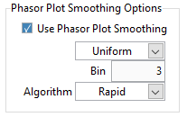
Each pixel’s phasor is replaced by the average phasor obtained using b x b pixels centered around that pixel, using weights defined by the kernel type.
Uniformkernel: the weight of all pixels is equal to 1.Bilinearkernel: the weight of each pixel decreases linearly from 1 at the center down to zero for pixels outside the kernel, proportionally to its distance from the center.Gaussiankernel: the weight of each pixels is proportional to a normal distribution with standard deviation = b/3.
Smoothing the phasor plot is not recommended for data sets with good signal-to-noise ratio (SNR) or for in vivo datasets, as this operation artificially couples regions with potentially different lifetime characteristics and therefore creates artifacts (“bridges”) in the phasor plot.
For instance, the phasor plot represented above will look as shown below when using a Phasor Plot Bin value of 3 (and a bilinear kernel).
Remember to press the Refresh Phasor Plot button (top left corner of the image) to apply this new setting.
Note that the phasor plot image calculation takes some computational time and might not be useful during series analysis. In order to speed up analysis, it is therefore possible to skip this process by unchecking the Active checkbox at the top left corner of the panel.
Phasor Plot Settings and Controls
The Phasor Plot image uses the same settings used by the Phasor Plot graph
(Phasor Graph panel). In particular, phasors are corrected by the same
calibration phasor (or calibration phasor map), if one is defined and selected
(Single Phasor/Phasor Series/Phasor Map options of the
Calibration Type pull-down list in the Phasor Graph panel or in the
Settings:Phasor Calibration panel).
For series analysis, each image’s phasor plot image uses the corresponding calibration point of the calibration plot, if one has been defined and selected.
The controls on the right-hand side of the panel (Phasor Plot Color Scale, Phasor Plot Display Range) are used to control the appearance of the phasor plot image. The actual palette used for the phasor plot is selected via the image right-click menu, as explained in the Image Color Palette section of the manual. Pixels with value outside the indicated range will be displayed with the Low Color or High Color shown at the bottom and top of the color scale, respectively.
The Refresh Phasor Plot button (recycle icon) at the top left corner of the image is used to refresh the Phasor Plot if one of the controlling parameters mentioned above has been modified. Note that the phasor plot will not be recalculated if none of the parameters influencing it have been modified.
Other settings can be found in the Phasor Plot of the Settings panel.
Phasor Indicator
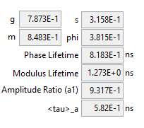
When the cursor is located in the image part of the Phasor Plot, and the
Shift key is pressed down, a Phasor at Cursor indicator is shown,
indicating the phasor components at this location, as well as the phase and
modulus lifetime, and when phasor ratio references are defined, the phasor ratio
and average lifetime. This indicator is hidden when the cursor is not within the
image display and the Shift key is not pressed down.
This is also true when the cursor is in the Source Image and the Shift key
is pressed down. In this case, the phasor at the cursor location in the source
image is indicated.
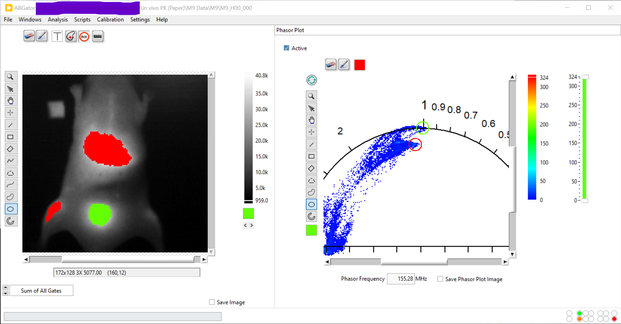
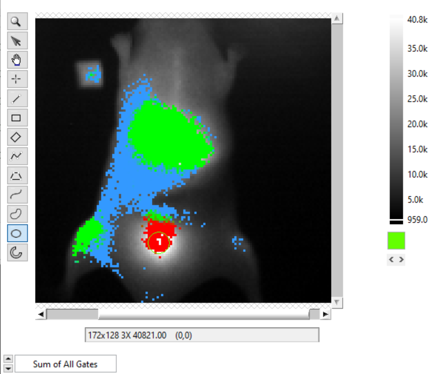
Highlighting Phasor ROIs in the Source Image
The Highlight Phasor ROI button on the top left (pencil icon) is used in conjunction with the Image Overlay Color box to its right to highlight pixels in the Source Image corresponding to the selected region in the Phasor Plot and to show the selected ROI in the same color in the Phasor Plot.
To select a ROI in the Phasor Plot, use one of selection tools on the left
hand side tool palette. The ROI will be overlayed in the selected color on the
Phasor Plot and the corresponding pixels will be highlighted (painted) with the
same color on the original image. Choosing a transparent color (T) will
result in no overlay being added to the Source Image.
The image below shows an example where two different ROIs were selected successively and highlighted with different colors (pink and blue):
Note 1: The picture above corresponds to an older version of AlliGator.
Note 2: For best contrast, it is recommended to choose a Grayscale or
Temperature palette for the Source Image.
Pressing the Refresh Phasor Plot or the Clear Phasor Overlay (eraser icon) buttons clears the overayed ROI(s) in the Phasor Plot. The similar buttons in the Source image will erase its overlays.
Phasor Plot Context Menu
The context menu of the Phasor Plot image is shown below:
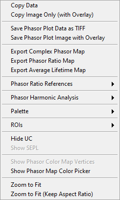
This menu functions in the same manner as that of the Source Image. See the Context Menu section of the manual for further details.
Some functions are specific to the Phasor Plot and are described below.
Saving the Phasor Plot Image
Save Phasor Plot Data as TIFF: This will save the 2-dimensional histogram shown in the Phasor Plot image as a TIFF image in the same way as the Source Image context menu function does.
Save Phasor Image with Overlay: While it is possible to right-click on the Phasor Plot and use the
Copy Datamenu item to copy the phasor plot image object to the clipboard, this includes the object’s frame and tool palette, which are of little use. The context menu offers an alternative in the form of theSave Phasor Image with Overlayfunction. This function saves the visible part of the phasor plot (e.g. if the plot was zoomed in), including overlays, as a file with format specified by the Saved Image File Format control in the Settings:Miscellaenous panel. The file can be of type PNG, JPEG or BMP. The name of the file is Phasor Plot Name.XXX where “XXX” is the file format and “Name” is the folder containing the current data set folder (for Gate Image Folder) or current data set name.In addition, it is possible to automatically save the Phasor Plot image after it has been computed, by checking the Save Phasor Plot checkbox. This is particularly useful during a series analysis, and an animated sequence needs to be created for presentation purposes.
Export Complex Phasor Map
The complex phasor data (H x V matrix) calculated to form the phasor plot can
be saved using the right-click menu Export Complex Phasor Map.
This will save an ASCII file (comma separated values) with H columns and V
lines of complex g + i s phasor values, where H x V is the image dimension.
Phasors that were not computed (due the selected settings are replaced by
NaN + i NaN.
Export Phasor Ratio Map
When phasor ratio references are provided and the phasor ratio has been
overlayed on the Source Image, the corresponding phasor ratio map can be
exported to an ASCII file using the Export Phasor Ratio Map shortcut menu.
Export Complex Phasor Map
When phasor ratio references are provided and the average lifetime has been
overlayed on the Source Image, the corresponding average lifetime map can be
exported to an ASCII file using the Export Average Lifetime Map shortcut
menu.
Defining Phasor Ratio References in the Phasor Plot
To define phasor ratio references, the Phasor Plot offers similar functionalities to those of the Phasor Graph (see the Phasor Graph panel manual page for details), with the difference that the analysis involves all the phasors contributing to the phasor plot, which can potentially include all pixels of the source image. This can in particular result in outliers contributing excessively to the calculation of a fitted line or the major/minor axes of the phasor plot. In short, it is not recommended to use the phasor plot tools to define references, if it can be done within the Phasor Graph.
When the two references are defined and the Show References item of the
Phasor Ratio References menu is checked, the two references are shown on
the Phasor Plot (and Phasor Graph), as well as an oval region around them
encompassing the region of the phasor plot used for subsequent analyses. The
characteristics of the references dots and the oval region can be set in the
Settings:Phasor Plot panel.
There are two Phasor Plot-specific approaches to define references:
Manual Definition: One of the potentially useful tool present in the Phasor Plot is the ability to use the mouse to define the location of both reference 1 and reference 2. To do so, simply press the
1or2key while left-clicking the mouse. As long as the mouse right button is pressed and the numerical key is held down, the mouse position will define the corresponding reference’s location. Releasing the mouse button or numerical key “drops” the reference at that location.While one of the two numerical keys is pressed, a button with the corresponding number shows up at the bottom of the Phasor Plot is shown.
Segment Extremities: The
Use Segment Extremitiesfunction of thePhasor Ratio Referencesmenu allows using the line tool of the Phasor Plot image to define the location of the two references. In that case, the references are set to the segment’s extremities.
Representing Phasor Ratio/Average Lifetime/User-defined Quantities as a Color Map in the Source Image
The phasor ratio can be used to color-code pixels in the Source Image,
creating a “Phasor Ratio Map”. This requires switching the Overlay Mode
pull-down icon list to Phasor Ratio.
Derived quantities such as the average lifetime or even unrelated quantities such as user-defined quantities can also be used instead of the phasor ratio. Which quantity is mapped and how it is mapped is defined in the Phasor Plot panel of the Settings window described next.
To hide the phasor ratio overlay in the Source Image, simply refresh the Source Image.
Note: Highlighting ROIs defined in the Phasor Plot in the Source Image doesn’t work when the Phasor Ratio Map is shown.
Color Map Style Options
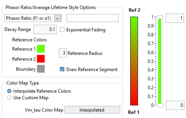
Displayed Quantity: it is a pull-down list at the top left with 3 options:
Phasor Ratio (f1 or a1)Average Lifetime (<tau>_i or <tau>_a)User-Defined Quantity
The nature of the phasor ratio (and hence of the average lifetime), i.e. intensity- or amplitude-averaged is specified by the Phasor Ratio Type* radio button in the Phasor Graph panel of the Settings window.
User-Defined Quantity: it is specified in the box next to the Displayed Quantity pull-down list. Enter a valid quantity name, which can be either an internal variable (f1, a1, tau_m, tau_phi, <tau>_i, <tau>_a) or a user-defined quantity as found in the Aliases Definitions window (see below for a description of this window).
Decay Range: This sets the range of phasors around the phasor ratio references that are used to compute the color overlay. If the Exponential Fading checkbox is not checked, the phasors kept for the color map are those within Decay Range the segment connecting the two references. If Exponential Fading is checked off, the intensity of the overlayed pixel is multiplied by \(e^{-d/range}\) where
rangeis the value of Decay Range anddis the distance of the phasor to the segment connecting both references. Any phasor beyond 3* Decay Range are ignored.Reference Colors/Radius and Draw Reference Segment are self-explanatory
Color Map Type is a radio button allowing switching between:
Interpolate Reference Colors: the Reference Colors are defined above and the resulting color map is shown on the right.Use Custom Map: used in conjunction with the Color Map pull-down list below.
Color Map: right-click on the indicator to reveal a list that offers standard palettes as well as the option to select a Brewer palette. Once selected, the resulting color scale is show to the right.
Color Scale: reflects the user choices discussed previously.
Display Range: used to limit the range of values over which the mapping is effective. Values in between these the two sliders are those to which the color scale is mapped.
Alias Definitions Window
This window can be opened when right-clicking in the User-Defined Quantity
box and selecting User-Defined Quantities List:
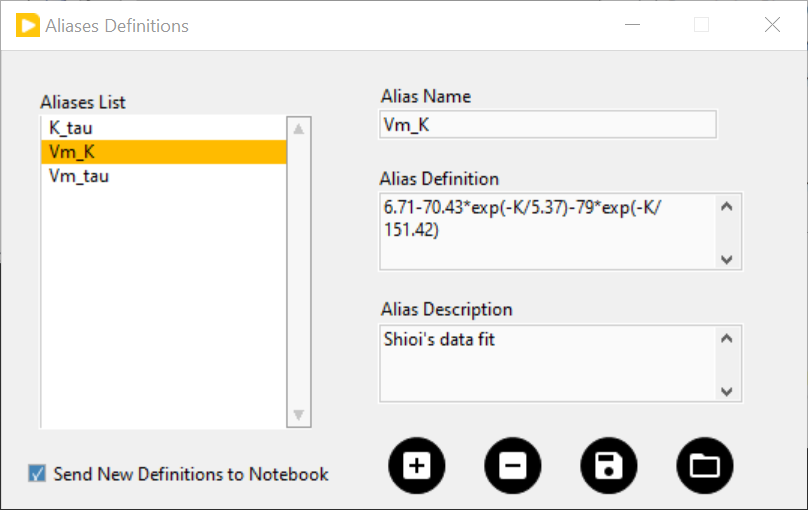
The Aliases List`` contains the user-defined quantities’ names that can be entered in the ``User-Defined Quantity`` box. The selected quantity’s name is reproduced in the *Alias Name indicator to the right, which is also used to enter the name of new quantities.
The Alias Definition box contains the mathematical formula allowing AlliGator to compute the user-defined quantity using any supported AlliGator variable. The formula displayed in the above snapshot is therefore not usable since the variable it uses (
K) has no meaning in AlliGator.The Alias Description box is used to enter a short explanation of what the formula is used for.
To add a new definition to the Aliases List, enter a Name (not already used and not an AlliGator variable), Definition and Description and click on the Add/Modify Alias (“+”) button at the bottom right. The new name will appear at the bottom of the Aliases List (or replace an existing one if the name was already in the list). If the Send New Definitions to Notebook checkbox is checked, the corresponding name, definition and description will be sent to the Notebook.
To remove a definition, select it in the Aliases List and click in the Remove Alias (“-”) button.
To Save the Aliases List (As an ASCII file), click on the Save Aliases (floppy disk) button. To Load an aliases list into the Aliases List control, click on the Loas Aliases (folder) button.
The window can be kept opened (or hidden) if needed. It won’t prevent from using AlliGator.
Color-coding Phasors with a user-defined Color Map
The phasor plot can sometimes be complex to interpret. A additional tool to
explore the location in the sample, of pixels characterized by different phasor
values, is provided by the Phasor Color Map option of the Source Image’s
Overlay Mode pull-down list:
This option uses a color map defined by the user in the Phasor Color Map Picker window opened by right-clicking in the Phasor Plot and selecting the Phasor Color Map Picker menu item:
This opens the Phasor Color Map Picker window:
Phasor Color Map Picker window
This window shows an empty phasor plot with the universal circle, in which a polygon can be defined by adding or deleting cursors in the right-hand table (minimum number of vertices: 3, no maximum number). The polygon’s interior is colored according to the vertices colors (defined by the cursors’ colors) and the Decay Range Exponent parameter. A large exponent will tend to result in sharp boundaries between colored zones, while a small value will tend to blur these boundaries. Negative values of the exponent can also be used for interesting effects.
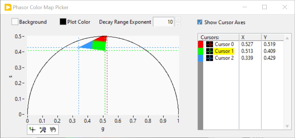
By checking the Show Phasor Color Map Vertices in the Phasor Plot context
menu, the same polygon is represented as an overlay (without the color map) in
the Phasor Plot:
This allows positioning the polygon’s vertices in the Phasor Color Map Picker window where needed in the Phasor Plot.
As the user adjusts the polygon (vertices number, colors and locations), the color map is overlayed on the Source Image:
The Phasor Color Map Picker window can be resized, and the color map saved and reloaded for future use using the right-click menu:
Save Color MapLoad Color Map
The file extension is automatically set to .col.