Graph Object
Multiplot graph objects are ubiquitous in AlliGator and are packed with many functionalities. Not all functions are available in all graphs (it wouldn’t make sense to fit a decay model to an intensity histogram, for instance), therefore custom function descriptions will be found in page manuals dealing with each specific graph object. The following will hold for most graphs, with some exceptions.
Graph Object Anatomy
A graph object is comprised of:
two or more graph scales

Plot Area
The plot area is the rectangular region in which plots are displayed. In the example shown above, a single plot is displayed, but in general, more than one plot will be present. The list of available plots is found on the right in the plot legend.
The appearance of the plot area can be modified in the following manner:
by modifying the range of displayed values (using the X and Y scales directly, or using the graph palette)
by showing or hiding grid lines (using the graph custom menu or the scale legend)
The different actions will be discussed in the respective object’s subsections below.
Plot Legend
The plot legend lists the plots stored in memory. Plot names do not need to be different, but it is easier to distinguish them if they are, especially when the list is long. In that case, a scrollbar will appear on the right-hand side of the legend. Move the scrollbar up and down either using the mouse wheel while hovering over the scrollbar, or drag the scrollbar with the mouse, or click on the up and down arrow at the top and bottom of the scrollbar respectively, to show the name of all plots.
Long plot names will not show up fully in the legend, but hovering over a plot name with the mouse will reveal a ‘tool-tip’ with the full name of the plot.
Plot names can be edited by clicking in them.
Each plot’s name is preceded by a checkbox, which defines whether or not the plot is actually displayed in the plot area. These checkboxes are also used as ‘selection’ checkboxes to perform custom actions on multiple plots at once, such as for instance saving the selected plots or changing their style. In other words, when performing an action on selected plots, the unselected plots are not visible in the graph.
The small image on the right of each plot name (plot icon) can be clicked on (right or left button) to give access to the standard plot menu.
Standard Plot Menu

This menu allows specifying (among other things):
the plot type (symbols only, line, line + symbols, etc.)
its color, line style, thickness and anti-aliasing
the color and style of the symbols (if used)
the scales (X and Y) associated with the plot (when there is more than one scale available per axis)
The Export options of this menu are less extended than those available
through the custom graph menu described next.
Custom Graph Menu
The following custom menu (accessible by right-clicking anywhere in the graph except for the plot icons and the cursor table) is specific of the Decay Graph in AlliGator, but many of its items are common to most graphs.
The most common (NOT highlighted in yellow in the figure below) are described next.
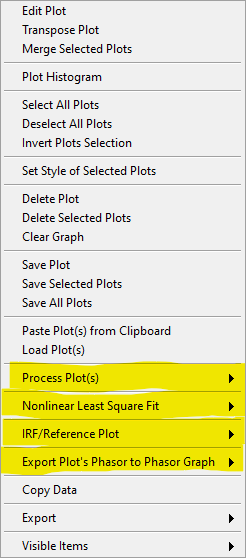
Edit Plot: opens the Plot Editor window.Transpose Plot: swaps X- and Y-arrays.Merge Selected Plots: appends the X- and Y-arrays of all selected plots. This can be used to build a single scatter plot from many smaller ones, or to stitch together decays covering different parts of the time axis.Plot Histogram: selecting this item opens up a dialog window allowing specifying options to define the way the histogram of the selected decay’s values is computed. The computed histogram is displayed in the separate Histogram Window.Select All Plotsdoes as it says.Deselect All Plotsas well.Invert Plots Selectionallows rapidly inverting the selected and deselected plots.Set Style of Selected Plotsopens a dialog window to change the style of all selected plots at once.Delete,Delete Selected PlotsandDelete All PlotsorClear Graphare self-explanatory (and irreversible).Save Plot,Save Selected PlotsandSave All Plotsallow saving plots as ASCII files (TAB separated columns of floating point numbers). The first line of the saved file consists in the plot names and their associated scales. When all plots have the same X-array, a dialog offers to save only one copy of it as the first column. Otherwise, the columns represent the X-array and Y-array for each plot, potentially resulting in columns of different lengths.Paste Plot(s) from Clipboard:Load Plot(s)opens a file dialog window with which one or more such ASCII files can be selected and loaded.Copy Datacopies the Graph’s image to the clipboard.Export: does the same thing as theExportsubmenu of the plot menu, that is, either export the selected plot data to the clipboard or to ExcelVisible Items
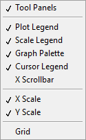
The Visible Items menu allows rapidly hiding/showing all objects except for
the Plot Area and Plot Legend using the Tool Panels item (useful for
instance to copy/paste the graph image to the Notebook without the Graph
Palette, Scale Legend and Cursor Legend), or different objects of the
graph individually.
The Grid item of that menu allows rapidly showing/hiding a grid in the
Plot Area, rather than using the individual axes menu in the Scale Legend.
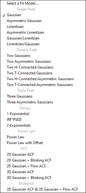
Fits submenu
Some graphs offer options to fit curves with model functions. An example of
supported models that can appear in the corresponding Fits submenu is shown
below:
.
Graph Scales
Most graphs have a single X (horizontal) and Y (vertical) scale, but some may have two or more, on either side of the graph (top or bottom for the X scales and left or right for the Y scales).
The visible bounds (min and max) of each scale can be edited by clicking on their respective values. Likewise, the scale title can be modified by clicking on it and editing it.
Further modification can be performed using the Scale Legend.
Scale Legend
The Scale Legend comprises the scale title (editable), an autoscale lock button, a single-autoscale button and a scale options menu.
The autoscale lock enables the graph to adjust its range automatically when a plot is added, so that all selected plots are visible. If this is not desirable, click the button to disable the autoscale option.
The single-autoscale button allows applying autoscale once only.
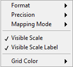
Finally, the scale options menu shown below provides option to format the scale tick labels, set the displayed precision, and choose between linear and logarithmic scaling. It also enables hiding a scale or only its labels and select the grid color.
Graph Palette
The Graph Palette allows switching between tools to interact with the plot area:
cross: cursor manipulation
magnifying glass: zoom tools to adjust the plot area range(s)
hand: panning of the plot area
Cursor Legend
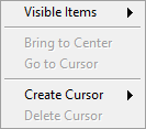
The Cursor Legend (or Cursor Table) shows the list of available cursors, to
which individual cursors can be added (Create Cursor) or can be removed
from (Delete Cursor).
The table also gives access to individual cursor properties (style, color, etc.) as well as associated plots, coordinates and plot value(s).
Finally, Bring to Center and Go to Cursor move the selected cursor to
the center of the Plot Area or recenter the Plot Area on the selected
cursor. The former provides a convenient way to locate a cursor and then
fine-tune its location.